EQUITE
Project objective
Equite were growing beyond purely networking for lead generation and wanted to showcase the success they’ve had finding properties for their clients, so they hired us to design their corporate website that would highlight their business advantages and unique offer to customers.
Unique Challenges
Inciting the right emotion
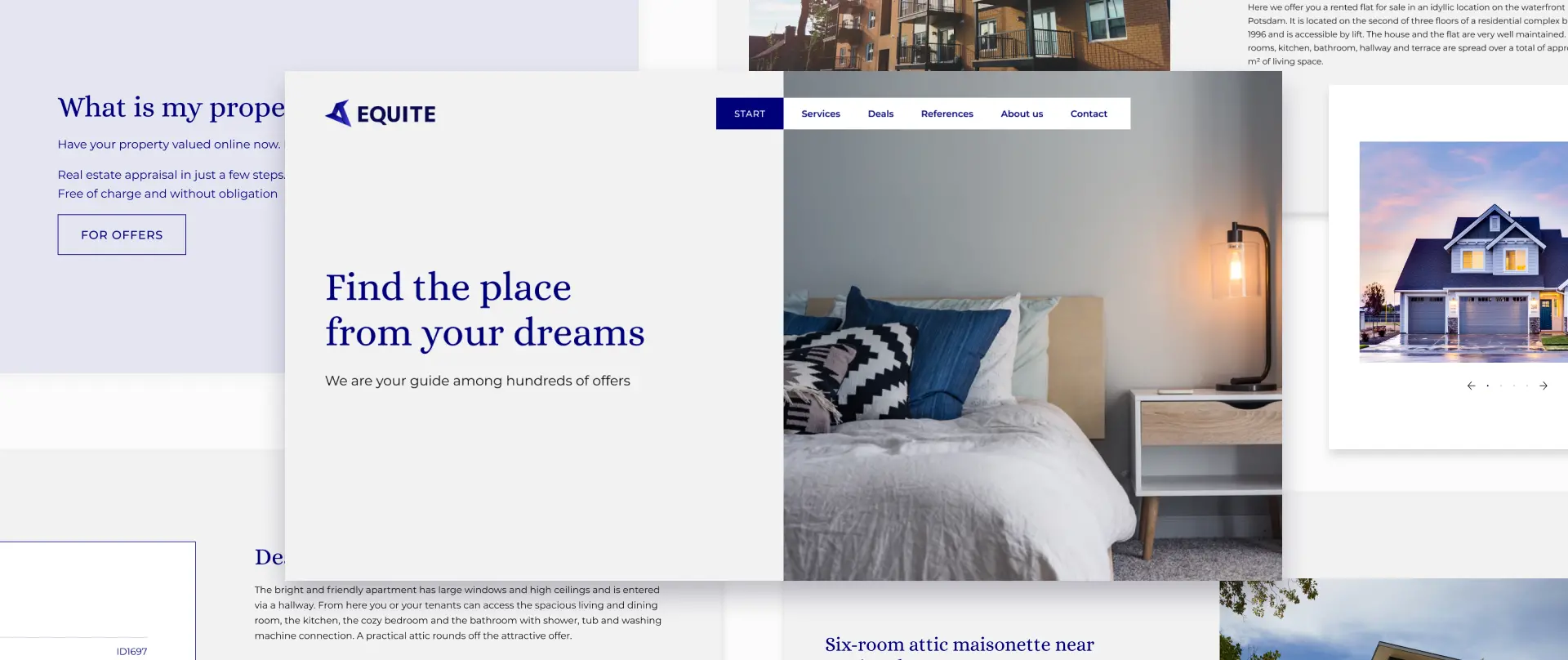
Equite positions itself as a one stop shop for finding your dream home. Our experts filled the website with comfy and stylish imagery and made the UI simple and straightforward to make the experience relaxed and inspire the feelings of comfort and security.
Finding the balance between simplicity and informativeness
Our UI/UX Designers had to fit in a lot of information in a way that wouldn’t diminish the overall roomy and airy feeling of the website and take away focus from images which are the main accent of the website.
Project Stats


Deliverables
IDENTITY
Branding
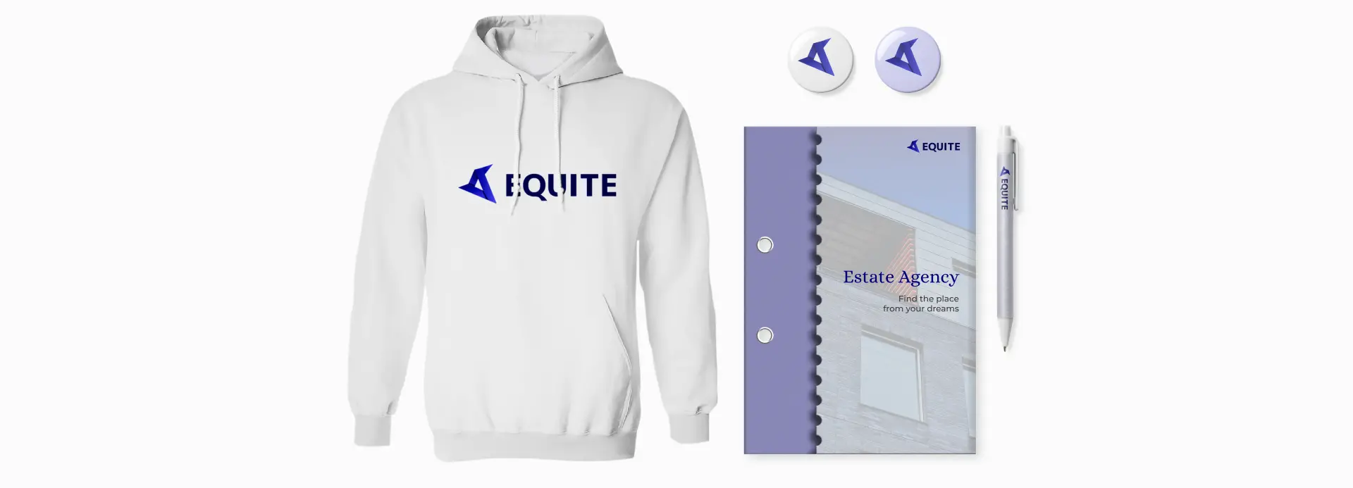
Equite asked us to create some merch that would distinguish their agents and serve as a reminder of their affiliation.
CORE
Service page
Equite don’t sell pre-packaged services, but rather serve as a real estate partner, bringing decades of experience and their influential connections to the table to solve any kind of property-related issues. We’ve designed this page to instill trust with business-related images and communicate what problems Equite experts can help solve without delving into technicalities.

CORE
References
One of our key tasks was to showcase the past success of Equite. Customers can see a selection of properties that were acquired with the help of Equite as dream houses for their customers and see the key parameters of each property, noting that some properties were acquired substantially below market price.
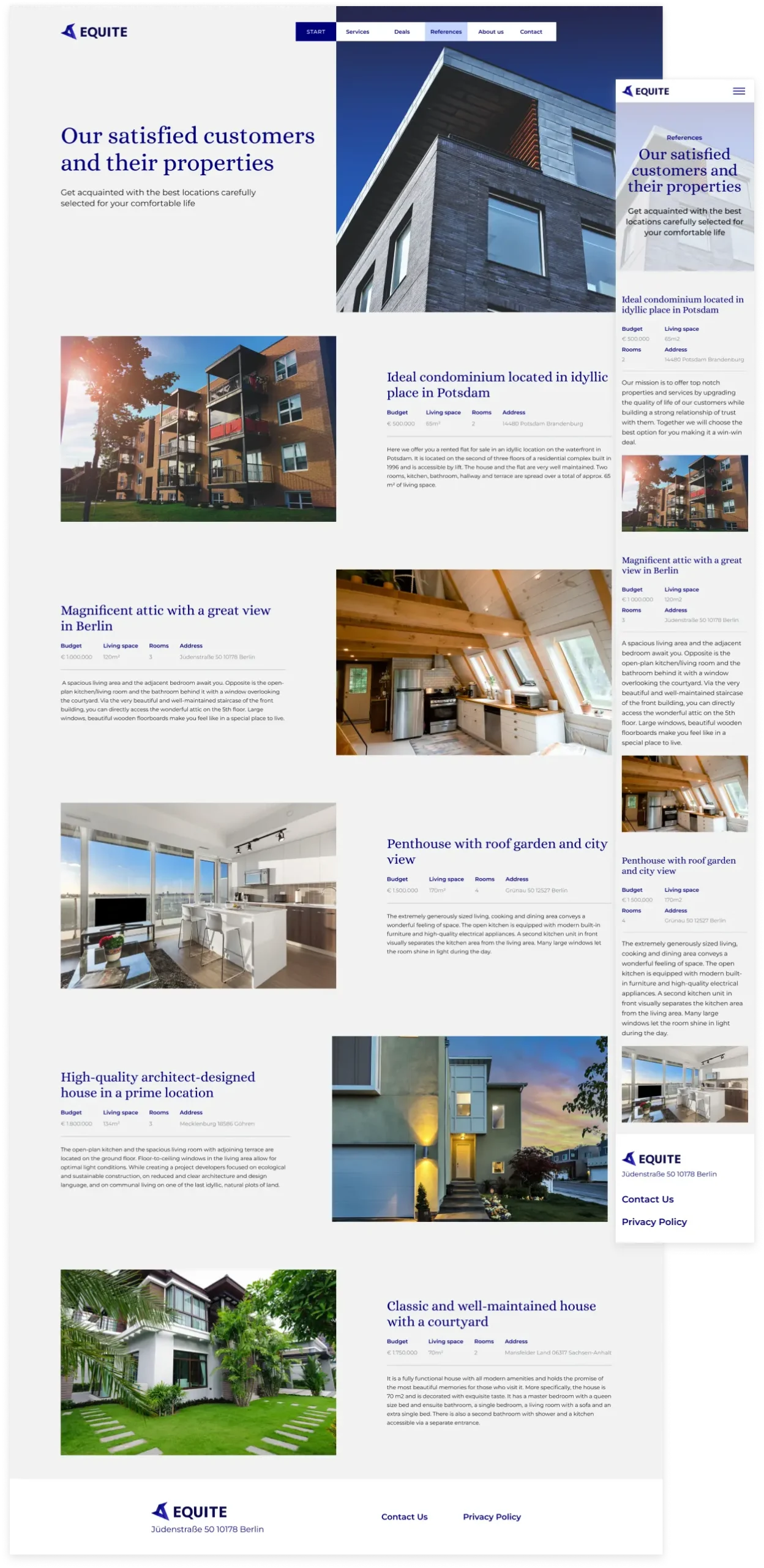

Property cards
Our designers created property cards to be universally applicable to any type of property. The focal point of each card is a slidable image gallery containing different views of the property, while the informational block to the right contains a short description along with the main characteristics.

Visual storytelling
Keeping the focus on the pictures and letting them tell the story, ColorCreative copywriters strived to say more with less, keeping the text short and concise. Our aim was to have text take up less space than images so that the visitor's eyes would naturally fall on them.

Easy & intuitive navigation
The entire menu is available at the top of the page and is simple to navigate. The page you’re currently on is highlighted with a light accent to make browsing through the website even easier.


REACH OUT